'How do I make my slides look less rubbish?'
As a designer, I get asked this question all the time... I frequently get sent my colleagues' presentations which need, in their words, 'Gaya's magic'. ;-)
But it's not magic, really, just applying a few basic rules of layout and design. There are a few ways to approach the subject of making your PowerPoint slides perfect. In this mini series, I would like to give you a few pointers which will help you if you think your slides need 'beautifying', making them more sleek and easier to read. Starting with the most important one, in my view.
Remember white space!
A very common mistake is trying to squeeze as much information into one slide as possible. The problem is that if you throw too much on the screen you get chaos and a slide that's really hard to read.
You need to become friends with 'white space' (or 'negative space”), which refers to the empty space between and around elements of a design or page layout. Some consider it a waste of valuable screen estate, not realising it is an essential design element which keeps the content clear to read.
Separation and reducing slide clutter
A cluttered page is unattractive and difficult to read. So, if there is too much on the page and, by adding white space, you are running out of space it means you need to remove some content.
Improved readability and comprehension
White space can make the slide easier to read and scan and therefore improve readability and comprehension. It will guide users on a page, create balance and indicate hierarchy of elements. In other words it tells the receiver what to look at first and which parts to direct their attention to.
According to a study by Microsoft, the average human being now has an attention span of eight seconds (less than a goldfish, with a impressive nine-second attention span!). If you would like your slide to be remembered and understood in seconds, keep it simple and use plenty of white space, which has been proven to increase comprehension.
Less is more
White space implies elegance and sophistication. You might have noticed that, in their web and print advertising, many big brands use a ton of white space. It's because it screams luxury and elegance. And confidence in their message.
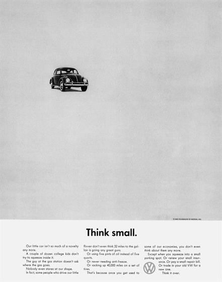
Consider one of the old, but famous Volkswagen ads 'Think small'. This revolutionary advert contained only essential parts of the message, leaving room for the viewer’s gaze to rest. The result was a simple, uncluttered and honest advert that reflected the 'no-frills' offering of the Beetle itself.
This minimalism principle translates really well to presentation design. You should always aim to present your content as clearly and cleanly as possible, and the best way to do this is to get rid of clutter and anything non-essential. Check out this article for some excellent examples of minimalism applied to presentation design.
Active and passive white space
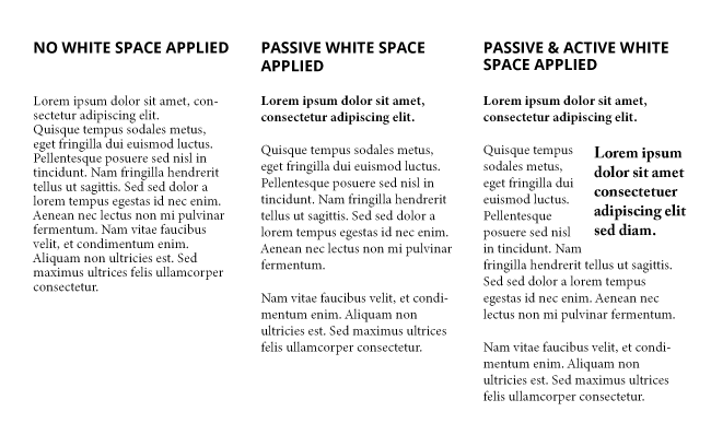
White space can also be either active or passive. Active white space refers to creating white space around elements that are often asymmetrical or inconsistent with the rest of the composition, which helps create focus and the focal point of your slide.
Passive white space
refers to space between elements to make sure they look aligned and symmetrical. It occurs naturally, for instance between text lines or graphic elements, or margins around the page / graphic elements. This also means paying attention to equal spacing between elements, especially if they are in a group. The equal and consistent spacing gives the design a cleaner look - so make sure you become good friends with the PowerPoint align tool. Also, adding more space to a design element such as a logo will make it stand out more.
There you have it! Hopefully now you will know that white space is not a wasted space. Remember, the things you leave out are just as important as those you use! So, if you keep staring at your PowerPoint slides thinking: 'it looks ugly, but I don't know why...' consider: 'White space: is there any? Is my spacing consistent? Are my important design elements jumping out enough? Do I need to remove something?'. Put your chaos in order by using white space and applying these few rules of layout and design.
In the next two articles, I'll give you some tips on how to work with type and colour to improve your PowerPoint presentations.
--------------------------------
More useful reading:
Design Principles: White Space, The Paper Mill Store
Using White Space in PowerPoint Design—a Closer Look, Slide Genius
Why White Space Looks Good in Presentation Design, Slide Store
 unknownx500
/Passle/53d0c8edb00e7e0540c9b34b/MediaLibrary/Images/50f7dfcdd44fb153b05420f0/2023-06-22-14-12-33-947-649456d11f170f4787c17956.jpg)


/Passle/53d0c8edb00e7e0540c9b34b/SearchServiceImages/2022-05-12-15-54-32-158-627d2db8f636ea15f8071da1.jpg)


